top of page

Mobile app and digital eyewear product system concept design for GWU New Venture Competition 2024

Project Overview
Ski Vision reimagines the traditional ski goggles by incorporating AR and audio-visual aids to enhance rider safety and experience.
This concept design includes a mobile app prototype and a goggle spatial interface demo designed to cater to the typical needs and concerns of skiers and snowboarders when in motion.
Roles
User Research
Product Prototyping
Visual Identity
Usability Testing Planning
Project Management
Recognition
2024 GWU New Venture Competition
Explorer Track Semi-finalist
Scope of Work

Date and Duration
Sep 2023 - April 2024
Tools
Figma, Adobe After Effects, Blender, Userlytics, Maze
Problems in the In-Resort Snow Sports Scene
1,353 total
patients
or 117 annually with severe skiing-related injuries from 2007-2014.
57 fatal
accidents
occurred in Colorado the 2021-22 winter season, 19% increase from the previous season.
30% injuries & fatalities
are caused by collisions with other skiers and stationary objects.
High Physical Risks
collisions account for 40% snowsport accidents annually in the US.Most collisions happen due to the lack of awareness in blindspots
Ineffective Buddy System
indirectly contribute to the high fatality rates since buddies
can assist in emergency support, injury prevention, and
offer additional awareness.
Top Pain Points According to 8 Generative Interviews

Heavy Logistical Effort
is essential and cannot be avoided to ensure a safe and
enjoyable ski experience.

How might we cultivate a safer on-slope experience and ease the mental load for snow enthusiasts?
Design Goals
1

Improve blindspot
and hazard awareness
2

Enable buddy System when not in close proximity
3

Reduce mental load
Product Strategy

This simplified information architecture of the goggle and the app show how the two devices interact with and compliment each other.
Feature Mapping
3D Trail Map
(primary)
Navigation
(primary)
SOS
(secondary)
Visual-Audio
Cues
3D Trail Map
(secondary)

App Settings
Navigation
(secondary)

Goggle Settings
SOS (primary)

Data Storage
Rationale: secondary access point for key features in case goggle runs out of battery or gets damaged.
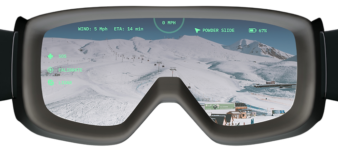
Design Goal 1: Improve Blindspot and Hazard Awareness
Opportunities of Prevention and Intervention

Visual Iteration of
Reactionary Indicators in Motion

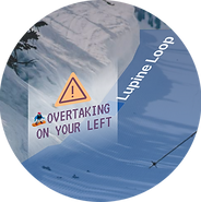
Indicator 1: Blindspot Detector (Uphill of User)
Version 1: Flashing Warning Badge
Iteration rationale: badge size too large, unnecessary visual obstruction, text is hard to read within seconds while badge is flashing
Version 2: Subtle Arrows in Increasing Opacity

Style 1: Rounded

Style 2: Pointy
Iteration rationale: The tip of the arrow indicates the direction of approaching overtaker, but visual take up significant space, potential point of contact needs more precision.
Version 3 (Final): Stroked Arrow With a Warning Icon

Start State:
Growing Arrow Indicator
rationale: to show the direction of the approaching overtaker
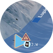
Friend State*
Growing Arrow Indicator
rationale: to show that the overtaker is a friend of the user

End State:
Enlarged Arrow Indicator
rationale: to show that the approaching overtaker is getting closer
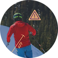
Indicator 2: Unsafe Distance Measurer (Downhill of User)
Version 1: Distance Ruler + Warning Icon
Iteration rationale: both color and ruler are hard to see
Version 2: Rectangle Highlight + Warning Icon

Iteration rationale: the size of a rectangle around a person is too large, which can be distracting
Version 3: Bracket Highlight + Subtle Warning Icon
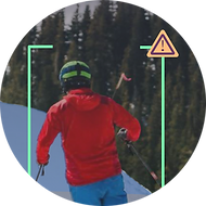
Iteration rationale: the warning icon is redundant in another feature, there are more optimal ways to visually convey urgency and prompt precaution.
Version 4 (Final): Bracket Highlight + Moving Target

Rationale: braket highlight around downhill skier if less than 6 ft away from the goggle user, and the orange moving target under the user works as a distance measurer, different opacity level indicates 3 levels of alertness within the safe distance.
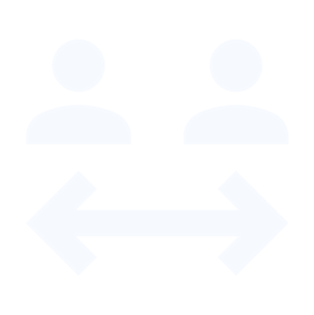
Design Goal 2 : Enable Buddy System
Potential Impact of a More Effective Buddy System
Users:
Collision-preventing features,
buddy locator, and SOS alerts
(visible in the buddy network)
Users’ direct network:
High visibility of buddy location
and status provides accountability despite not always being in close proximity.
Users’ community:
-
Higher vigilance of surrounding hazards
-
Movement informed by predictive alerts
-
Increased visibility in blindspots
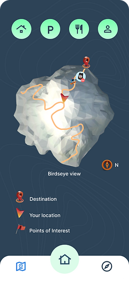
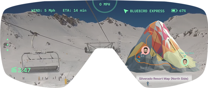
Real-Time Buddy Location + Status Embedded in Resort map
Increased visibility means increased vigilance, which translates to faster accident responses on the slopes.
map feature landing screen
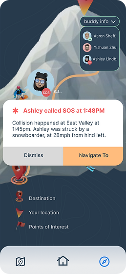
receiving an SOS message

navigate to SOS message sender
Sending and Receiving SOS
Internal and external messaging tool, directly facilitates rescue efforts.

In-session messaging inbox
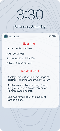
SOS message sent to Ski Patrol
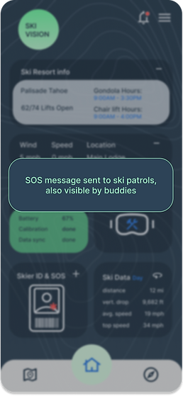
Message sent confirmation
Design Goal 3 : Reduce User Mental Load
User-Centric Task Flows
Relevant Information and tools placed strategically for easy access in both devices at every scenario to simplify the task flow

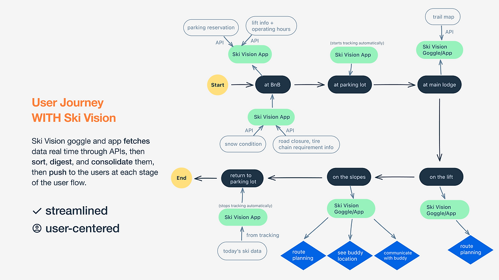
How the Goggle and the App Orchestrate to Streamline User Journey

Scenario: arriving at the resort

Scenario: on the chair lift

Scenario: locate and message friends
Scenario: arriving at the resort
1/6
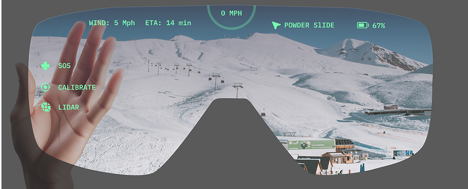
Minimal, Effective Menu Hierarchy
in Goggle Heads-up Display
Primary Menu, for Frequent Use


Secondary Menu, for Occasional Use


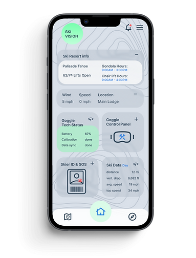
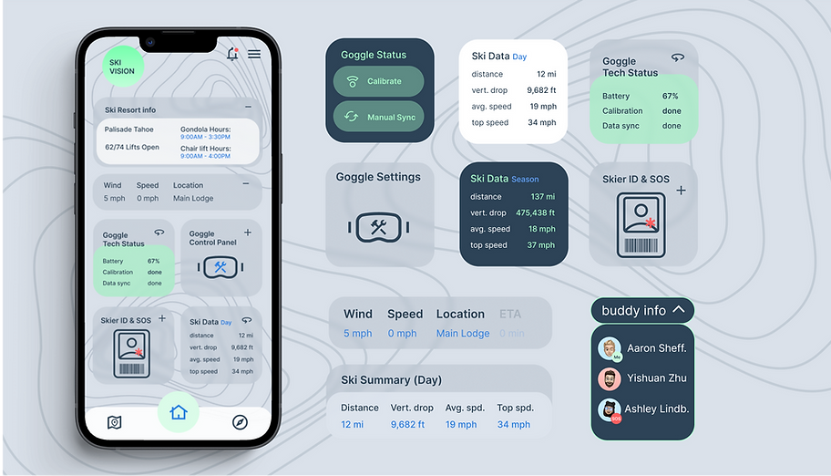
App Home Screen Is a Dashboard
with Key Info and Tools
user able to make quick decisions with convenient access
to available key info all in one place
Product Success Criteria
How well do these features solve the problems previously defined?
Lower Collision Rate
in user’s direct network


Shorter SOS response time
within user’s direct network

Increased effective
slope time


Measuring Product Effectiveness:
Usability Testing Plan and Rationales
Test topic 1: how quickly do users react to predictive alerts?

Measure and tally the occurrence with motion sensors

sudden drop in speed immediately after predictive alerts
making an abrupt
direction change immediately after predictive alerts
sudden drop in speed immediately after predictive alerts
Rationale: strong correlation between users’ reactions to predictive alerts validates the effectiveness of collision prevention features, if this test shows a lower overall collision rate than its control group (without product), then this success criterion is met

Test topic 2: How quickly do users show up to the SOS sender after receiving their SOS message? and vice versa?

Rationale: if the time gap between noticing SOS message and arriving at sender's location is shorter than its control group (without product), then this success criterion is met

Test topic 3: Do users spend less time on information-gathering and more time being active on the slopes?
Track user’s in-resort active slope time, compare with control group
Track user’s in-resort idle time, compare with control group


Rationale: if test data resemble the chart on the left in comparison to its control group(without product), then this success criterion is met
Challenges & Limitations
1
AR interface takes longer to prototype and test
Usability data are more valuable when prototypes are of higher fidelity, however 3D prototypes take much longer than 2D so test frequency has to be compromised when project duration is fixed
2
Data infrastructure design underpins product framework
Although not visible in the front end, database infrastructure and analytics is very necessary to this project, however I currently have only a surface level understanding of this topic
3
Fewer design guidelines
for reference
Until industry leaders such as Apple’s Human Interface Guidelines are released for Vision OS in Q1 2024, there were not a lot of design guidelines to reference
4
Need compatible hardware to test the interface prototype
Designing software for hardware that doesn’t yet exist requires a lot of imagination and constant reality checks, affecting both prototyping and usability testing
5
Regression testing is
necessary
Regression testing is necessary to verify wether goggle features are distracting compared to experience with regular ski goggles
6
Hardware-software integration is challenging
Compatibility testing and adjustments are necessary, hardware and software experts to constantly collaborate to bypass limitations
Next Steps

More testing for data informed decisions to improve features

Explore more cost-
and time-efficient solutions

Discover more niche user segments & understand their pain points

Explore More Projects


bottom of page